Hi there! Mimi from Mika78 and SevenEight blog here continuing Couture Week with some seriously gorgeous wedding invitation inspiration! There was a time when a wedding invitation had to look “the part”: crisp white paper with gold or silver engraving, perfectly matching white envelopes and response card, and a thin sheet of tissue paper carefully placed in between. There was nothing that really separated one invitation from the other. Well, times have changed, and I’m glad to say that we’ve come a LONG way since then.
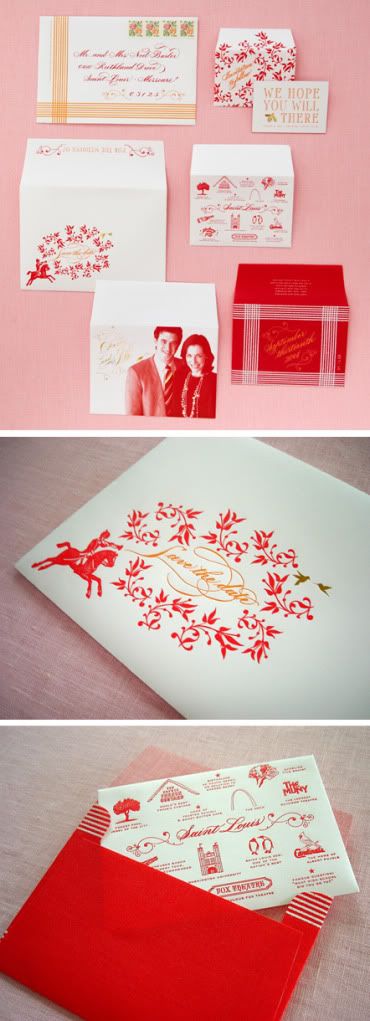
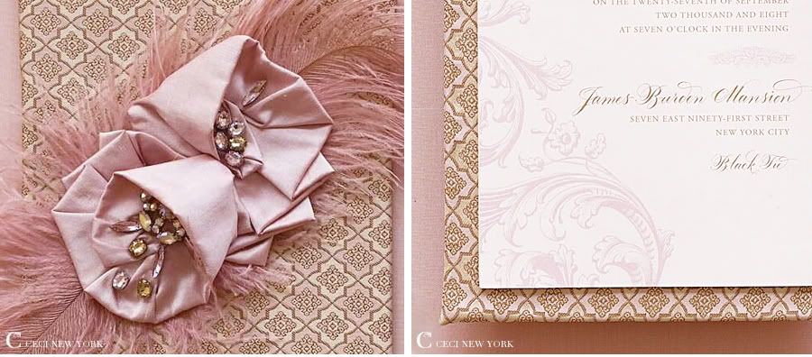
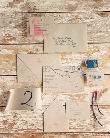
In my eyes, what makes an invitation “couture” is a combination of gorgeous design, quality materials/embellishments, and exquisite printing methods... but it’s also much more than that. The most successful designs are the ones with soul... the ones where you can really see and feel the personality of the couple shining through. I love seeing invitations that incorporate details that hold special meaning to a couple or designs that reflect the personal style of the bride and groom. Think of it as visual storytelling, every couple has their own story, why shouldn’t their invitation reflect just that? Of course, gorgeous materials and out of this world printing methods are fantastic, but they should be used to elevate design, not overpower it. The combination of all these things work together create something that’s not only beautiful, but also completely unique. It’s tailor-fit and one of a kind – true couture in every sense of the word.
This design (from Grapevine) is probably one of my all time favorites – I think it embodies everything a couture wedding invite should be. This Nantucket inspired wedding invitation was created in the form of a whaler’s journal (the bride had a love of books and her father had a lifelong love of whales). The journal included a 3 paged hand lettered invitation, map, and sketches, all neatly tucked into the flap of the linen cover. I love how they executed the nautical theme in such a unique way.
How great is this? The talented Cheree of Cheree Berry created this perfectly adorable save-the-date for her wedding last year. Cherry wanted all her wedding stationery to be full of surprises, so she based her save the dates off Russian Matryoshka dolls (you know, the dolls within dolls within dolls). So she created a series of seven envelopes - one envelope would reveal another, each with a different message... So clever!
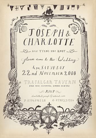
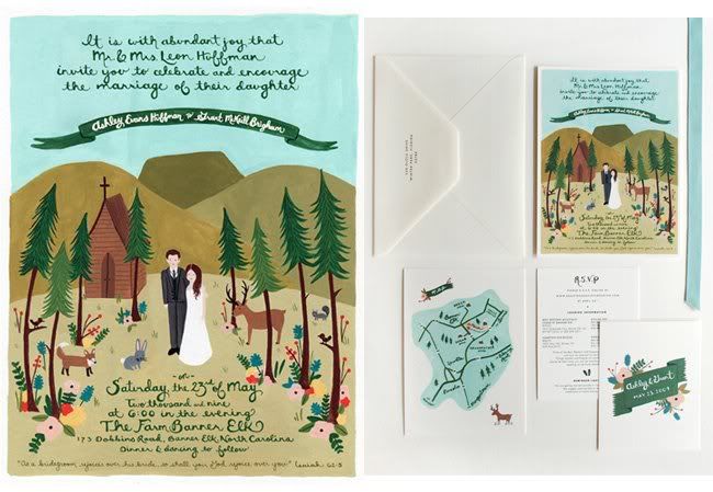
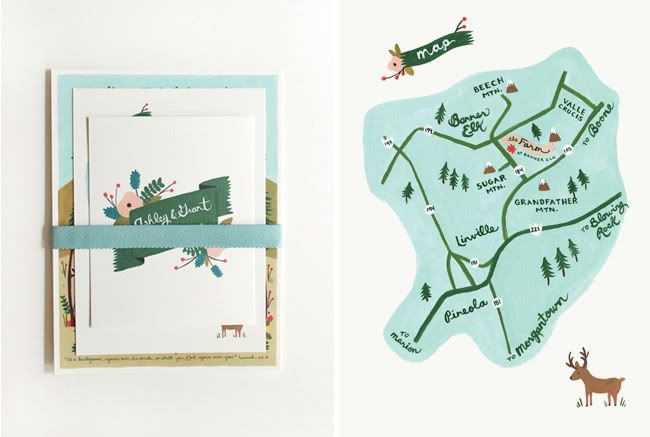
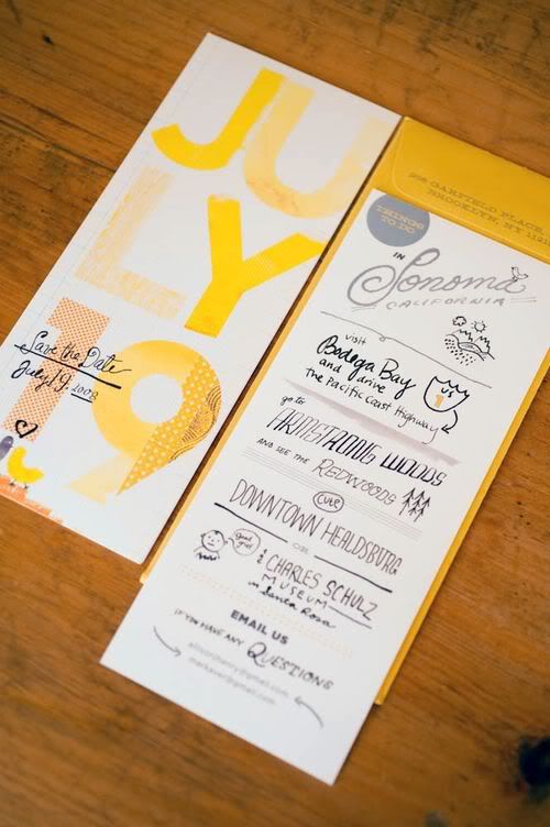
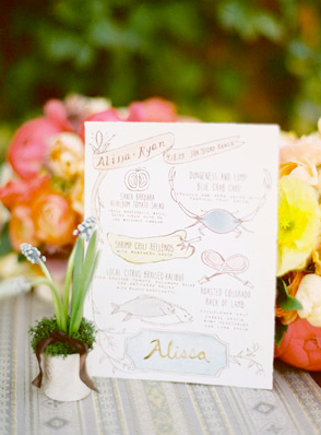
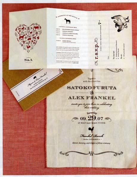
One big trend I’m seeing now: illustrated invitations. Whether it’s through unique calligraphy or a one-of-a-kind hand-drawn illustration of you and your love, there’s something magical and whimsical about this style that I adore.
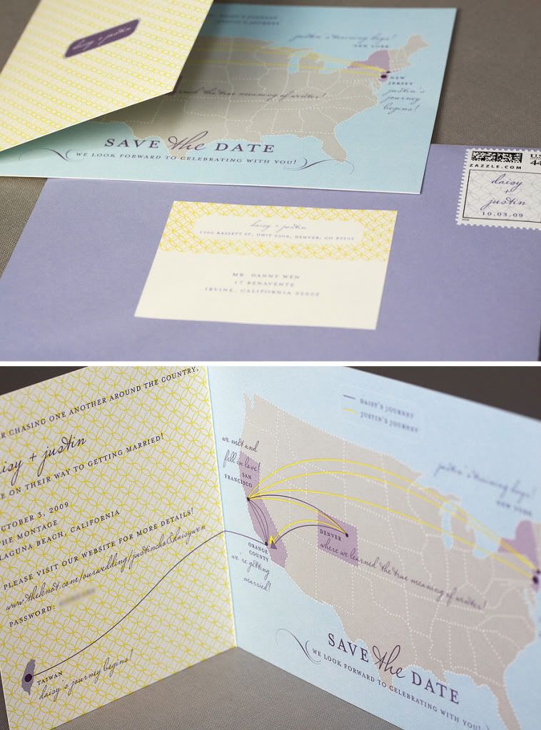
I love how these invitations tell a story (the first one below literally tells a story!). The second, by Minna Designs, illustrates how the couple spent most of their relationship on opposite sides of the country.
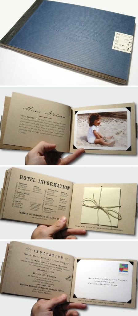
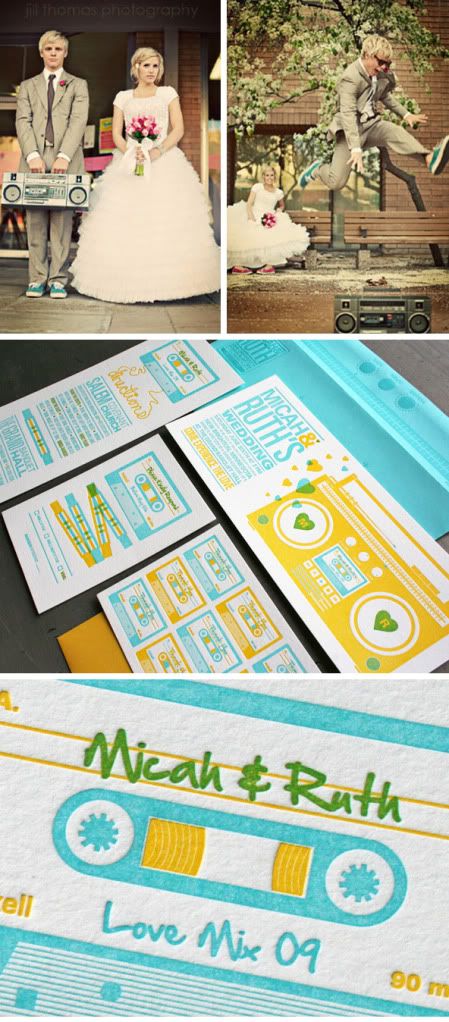
This is great – the groom designed this himself! A wedding invitation booklet that reads like an actual scrapbook.
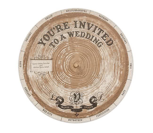
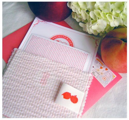
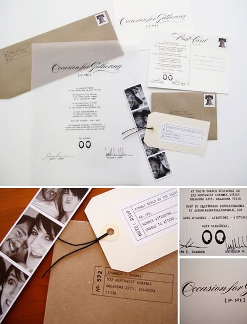
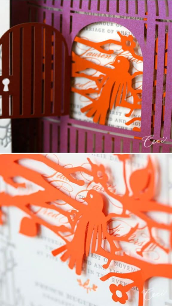
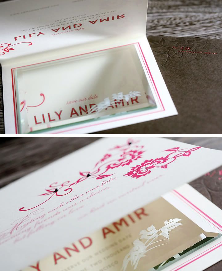
You don’t have to stick with a traditional rectangular invite and envelopes – get creative and think outside of the box by using unique materials and interesting ways to showcase your invitations. Aren’t these so fun??
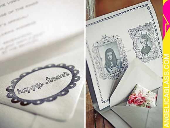
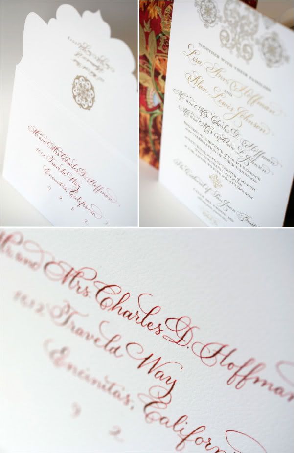
There’s something SO wonderful about holding a invitation with stunning printing and materials *sigh* (do I sound like a total stationery geek right now??). There’s so many great printing methods out there that really take a design to the next level. Try mixing screen printing with a touch of foil stamping, like the first invitation below (I just love the contrast between the matte ink and high shine of the foil stamp). I also love the idea of special die cuts, like the envelope second down. Just be sure not to go too crazy with over designing - usually having 2 or 3 special touches in a design is more than enough to do the trick. Check these out – stunning, no?
It’s been such a treat being part of Couture Week; thanks for having me, Dani! Can’t wait to see what’s in store for the rest of the week! And don't forget to enter in the couture handbag giveaway! xo.
In my eyes, what makes an invitation “couture” is a combination of gorgeous design, quality materials/embellishments, and exquisite printing methods... but it’s also much more than that. The most successful designs are the ones with soul... the ones where you can really see and feel the personality of the couple shining through. I love seeing invitations that incorporate details that hold special meaning to a couple or designs that reflect the personal style of the bride and groom. Think of it as visual storytelling, every couple has their own story, why shouldn’t their invitation reflect just that? Of course, gorgeous materials and out of this world printing methods are fantastic, but they should be used to elevate design, not overpower it. The combination of all these things work together create something that’s not only beautiful, but also completely unique. It’s tailor-fit and one of a kind – true couture in every sense of the word.
This design (from Grapevine) is probably one of my all time favorites – I think it embodies everything a couture wedding invite should be. This Nantucket inspired wedding invitation was created in the form of a whaler’s journal (the bride had a love of books and her father had a lifelong love of whales). The journal included a 3 paged hand lettered invitation, map, and sketches, all neatly tucked into the flap of the linen cover. I love how they executed the nautical theme in such a unique way.
How great is this? The talented Cheree of Cheree Berry created this perfectly adorable save-the-date for her wedding last year. Cherry wanted all her wedding stationery to be full of surprises, so she based her save the dates off Russian Matryoshka dolls (you know, the dolls within dolls within dolls). So she created a series of seven envelopes - one envelope would reveal another, each with a different message... So clever!
One big trend I’m seeing now: illustrated invitations. Whether it’s through unique calligraphy or a one-of-a-kind hand-drawn illustration of you and your love, there’s something magical and whimsical about this style that I adore.
I love how these invitations tell a story (the first one below literally tells a story!). The second, by Minna Designs, illustrates how the couple spent most of their relationship on opposite sides of the country.
This is great – the groom designed this himself! A wedding invitation booklet that reads like an actual scrapbook.
You don’t have to stick with a traditional rectangular invite and envelopes – get creative and think outside of the box by using unique materials and interesting ways to showcase your invitations. Aren’t these so fun??
It’s been such a treat being part of Couture Week; thanks for having me, Dani! Can’t wait to see what’s in store for the rest of the week! And don't forget to enter in the couture handbag giveaway! xo.

